
Cova
Branding & Identity Design
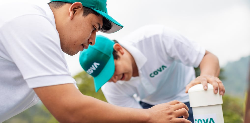
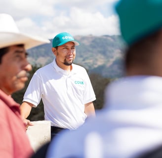
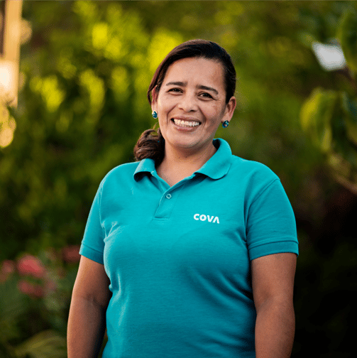
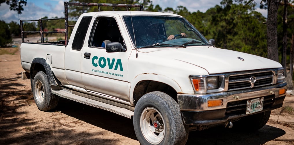
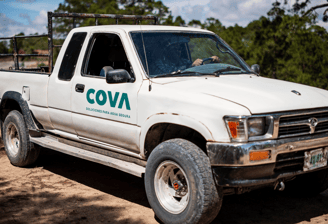
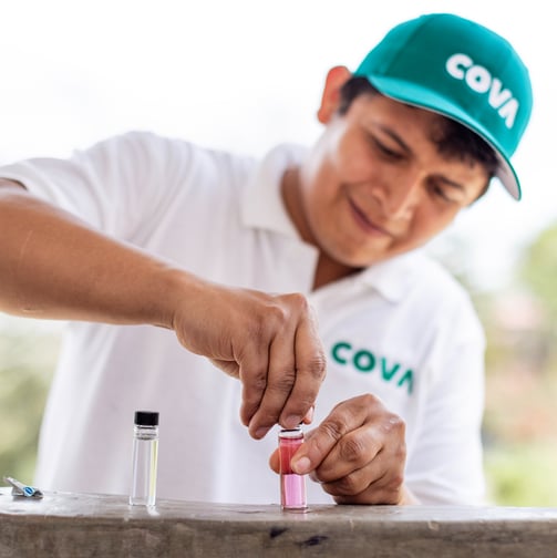
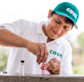
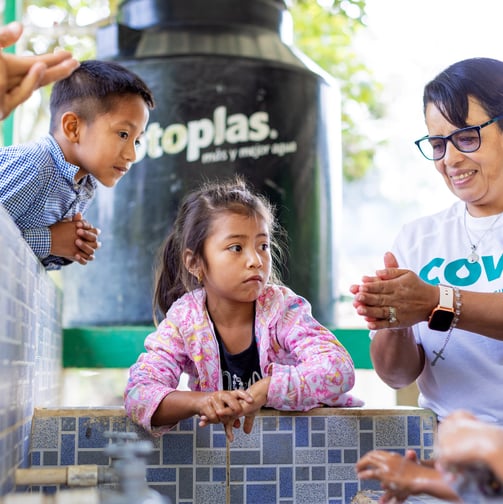
Cova is building a healthier Central America through community-centered safe water solutions.
The project
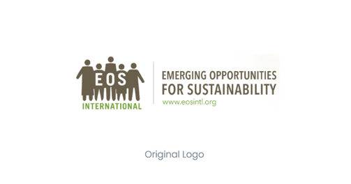
When COVA (formerly EOS International) approached us, they tasked our team with creating a compelling visual system and refreshed brand identity that would elevate their presence, support global expansion, and deepen engagement with stakeholders.
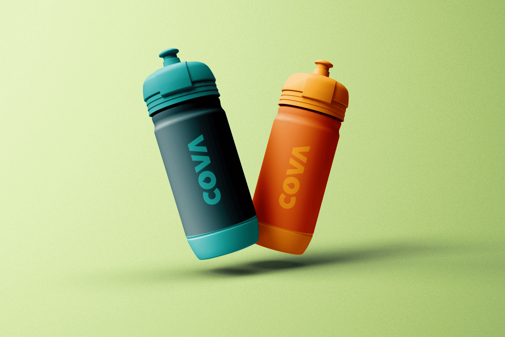
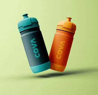
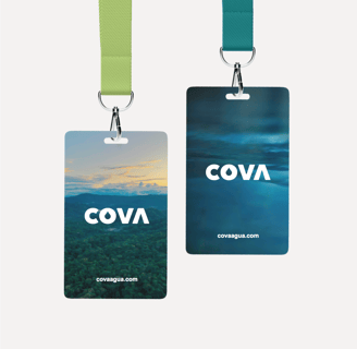
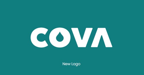
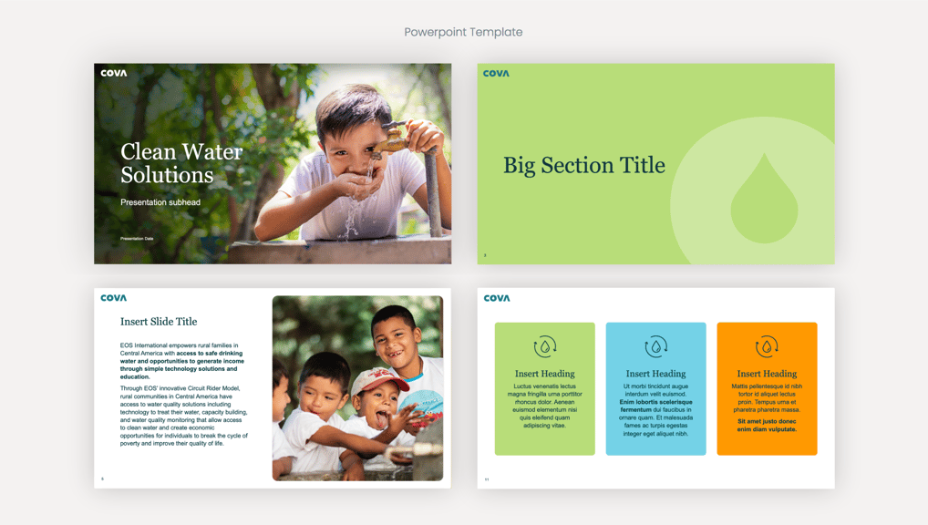
As the creative director, I led the development of a bold, versatile brand identity that captured the essence of the organization’s mission: delivering access to clean water through innovative technology. Our goal was to design a logo that would transcend language barriers, resonate across international markets, and reflect the science behind their work—particularly the purification tablet at the heart of their solution.
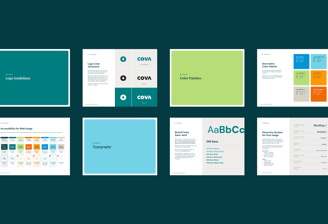
The approach
With the driving themes of science, water and partnership we took inspiration from one of the strongest bonds in nature: the covalent bond. Much like hydrogen and oxygen need one another to make water, Cova relies on successful partnerships to provide comprehensive clean water solutions to rural communities in Central America.
Once we successfully established the new brand identity, name, and visual system, my focus shifted to the launch strategy. With COVA's teams in both the United States and Central America, it was essential that our strategy was sensitive to the cultural nuances of the communities they serve, ensuring the launch would resonate authentically across all regions.


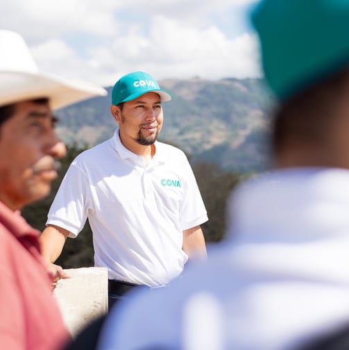
Once we successfully established the new brand identity, name, and visual system, my focus shifted to the launch strategy. With COVA's teams in both the United States and Central America, it was essential that our strategy was sensitive to the cultural nuances of the communities they serve, ensuring the launch would resonate authentically across all regions.
Once we successfully established the new brand identity, name, and visual system, my focus shifted to the launch strategy. With COVA's teams in both the United States and Central America, it was essential that our strategy was sensitive to the cultural nuances of the communities they serve, ensuring the launch would resonate authentically across all regions.
My contributions
Creative Director
Developing the Creative Vision
Researched existing competitors as well as our target audiences to identify effective visuals and messaging
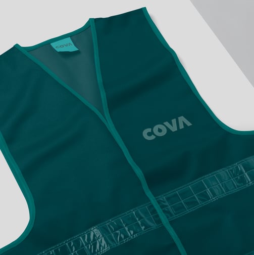
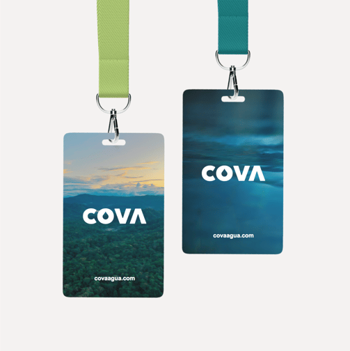
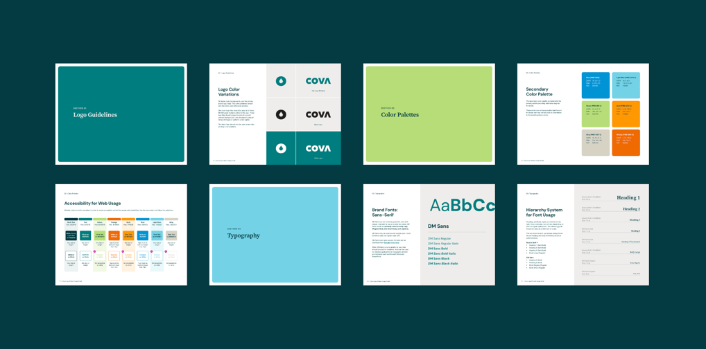
Defined the visual standards and guidelines; type treatments, CTA standards, color, etc.
Created a diverse library of stock images to have the biggest impact with our audiences
Designed the campaigns key visual "blueprint" elements: This included custom blueprint typography along with guidelines on how to apply the graphics to assets for consistency
Leading the Creative Team
Managed a small team of designers, copywriters, animators, and other creatives
Provided feedback on messaging and design, etc.
Ensured quality control on all deliverables
Monitoring and Adapting Creative Performance
Consistently reviewed the performance analytics of all creative assets
Made recommendations for adjustments as needed to optimize the campaign's impact
Implemented A/B testing of select ads and priority landing pages
Stewarding the Brand
Ensured the brand’s identity was consistently represented throughout the campaign, reinforcing its presence and positioning in the market
Ensured continuous alignment with CATF's core messaging, objectives, and target audiences to ensure the campaign effectively communicated its mission