The Family Partnership
Branding & Identity Design
The Family Partnership works with families and individuals to remove barriers and clear the path for success for those who have experienced deep poverty and trauma.
About the project
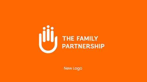
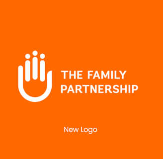
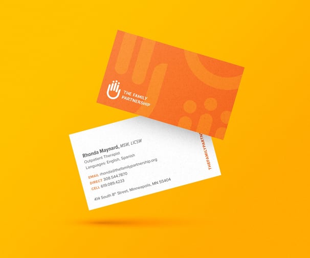
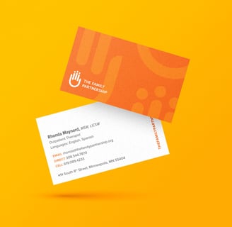
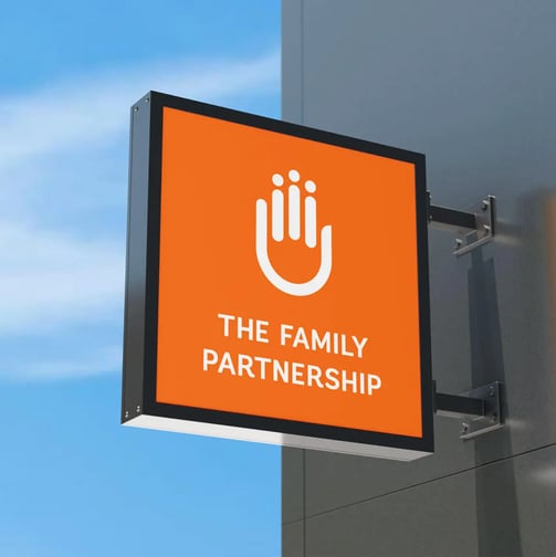
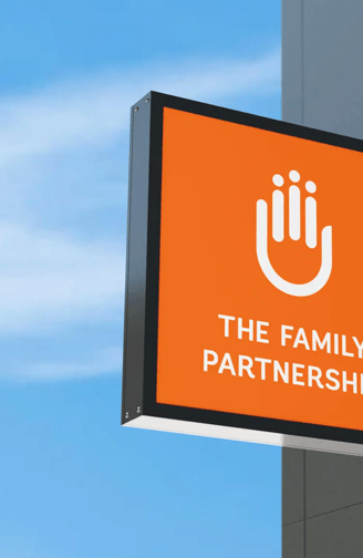
UPDATE: Led the logo refresh process by transitioning to a single color and removing the tagline, the logo encourages better brand recall. The new primary brand orange encapsulates the organization at its core – inviting, warm, inclusive, friendly and supportive, yet it instills a sense of urgency and a need for action. It represents the healthy community it strives to build: vibrant, forward, bold, positive, diverse and strong. The softened logomark sets the tone for open conversations led by humanity.

Brand refresh
Led the logo refresh process by transitioning to a single color and removing the tagline, the logo encourages better brand recall. The new primary brand orange encapsulates the organization at its core – inviting, warm, inclusive, friendly and supportive, yet it instills a sense of urgency and a need for action. It represents the healthy community it strives to build: vibrant, forward, bold, positive, diverse and strong. The softened logomark sets the tone for open conversations led by humanity.
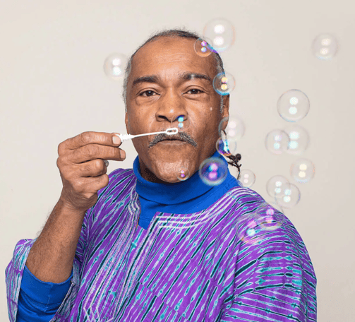
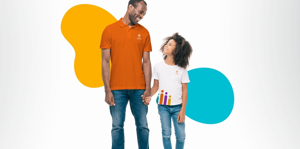
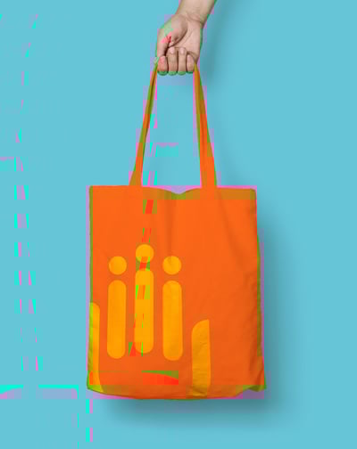
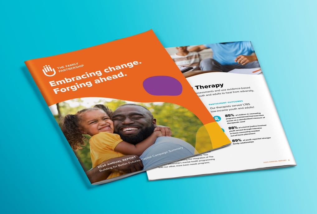
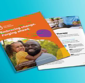
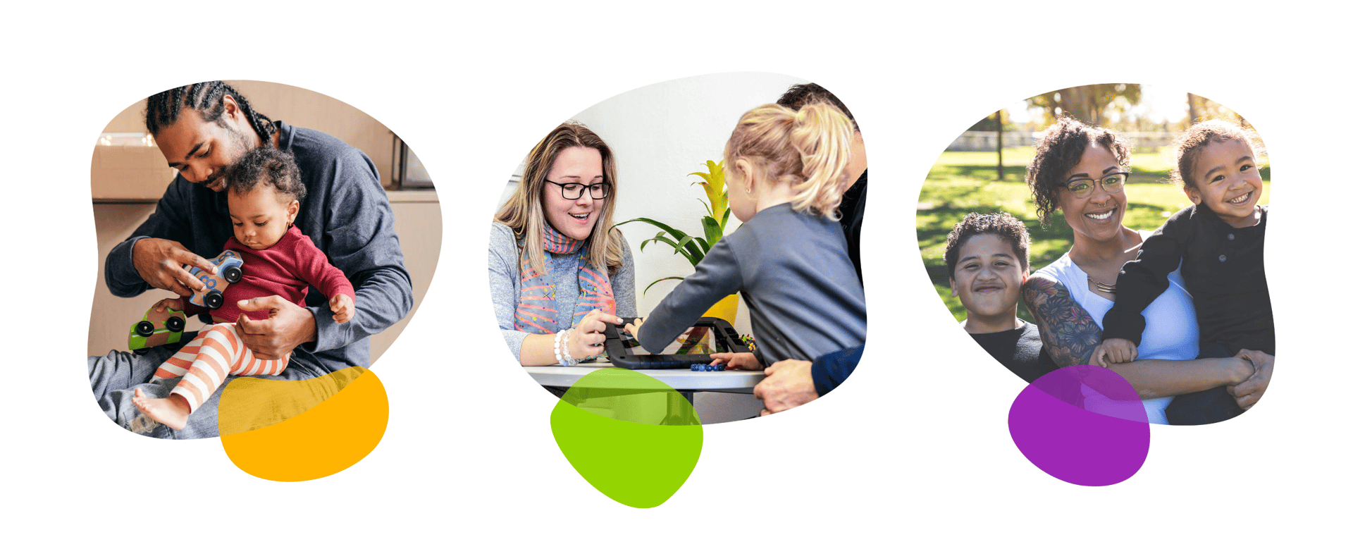
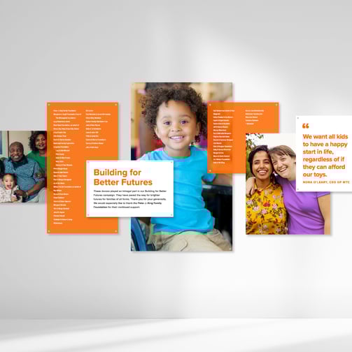
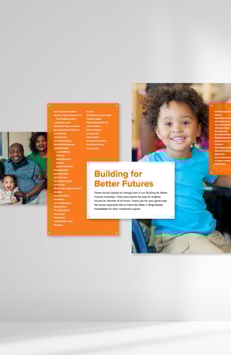
Provided creative direction for the development of additional materials, such as swag, digital and print collateral, custom iconography and patterns, interior and exterior signage, and a curated library of photos. All of the brand parameters were outlined in a fully designed usage guide to be referenced for all future brand applications.


Website design
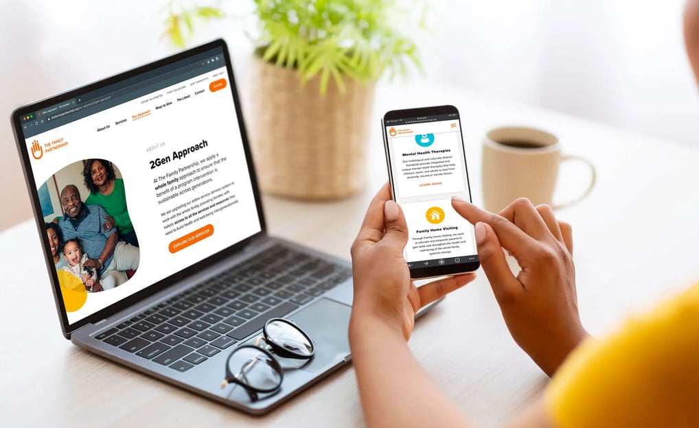
Our team interviewed all program leads to best understand how the website could support both staff and the families they serve. After auditing the existing content, I worked closely with the organization’s copywriter to ensure everything was accessible and web-friendly. I then designed a site that is easy to navigate, brings the brand to life, and centers the mission and humanity behind The Family Partnership’s work.
The campaign targeted individuals of all ages who value independent thinking and are open to exploring diverse solutions to solve the climate crisis. Through dynamic visuals and inclusive imagery, we connected these diverse audiences to CATF's mission, reinforcing the organization's role as a thought leader in addressing climate change.


Insert statement here about the image selection and shape creative direction...

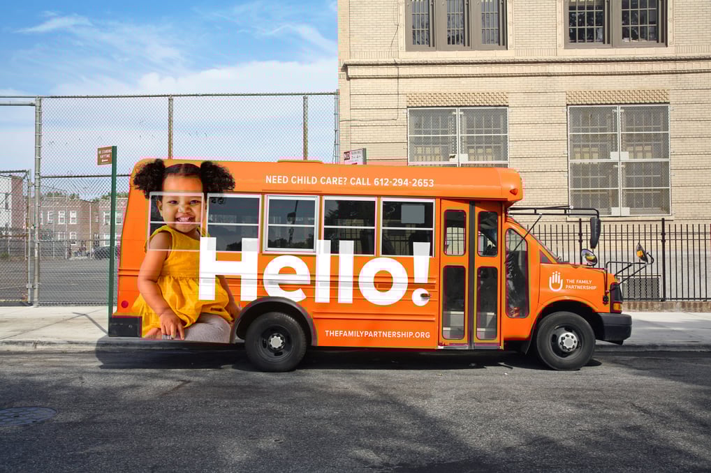
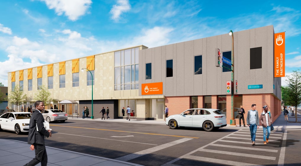
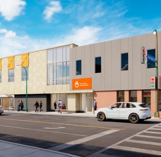
Experiential & Wayfinding
Our team interviewed all program leads to best understand how the website could support both staff and the families they serve. After auditing the existing content, I worked closely with the organization’s copywriter to ensure everything was accessible and web-friendly. I then designed a site that is easy to navigate, brings the brand to life, and centers the mission and humanity behind The Family Partnership’s work.
My creative process
“The 5IVE team truly exceeded our expectations when it came to helping us rebrand. From the outset, the team at 5IVE demonstrated a level of dedication that went beyond the ordinary. They invested not only their time and talent but also their passion and resources to ensure that our vision was realized to its fullest potential. Their guidance was invaluable, making the journey not just productive but genuinely enjoyable.”
Wesley Meier, Co-Founder & CEO, Cova
Detailed contributions
Creative Director
Developing the Creative Vision
Researched existing competitors as well as our target audiences to identify effective visuals and messaging
Defined the visual standards and guidelines; type treatments, CTA standards, color, etc.
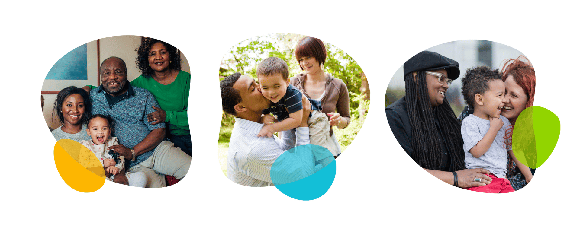
Created a diverse library of stock images to have the biggest impact with our audiences
Designed the campaigns key visual "blueprint" elements: This included custom blueprint typography along with guidelines on how to apply the graphics to assets for consistency
Leading the Creative Team
Managed a small team of designers, copywriters, animators, and other creatives
Provided feedback on messaging and design, etc.
Ensured quality control on all deliverables
Monitoring and Adapting Creative Performance
Consistently reviewed the performance analytics of all creative assets
Made recommendations for adjustments as needed to optimize the campaign's impact
Implemented A/B testing of select ads and priority landing pages
Stewarding the Brand
Ensured the brand’s identity was consistently represented throughout the campaign, reinforcing its presence and positioning in the market
Ensured continuous alignment with CATF's core messaging, objectives, and target audiences to ensure the campaign effectively communicated its mission