

The Family Partnership
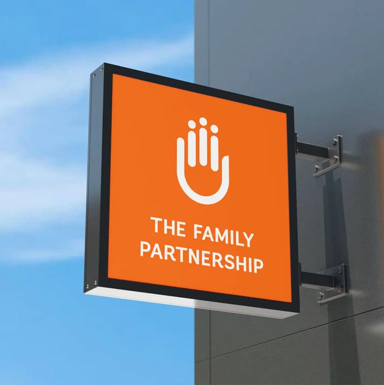
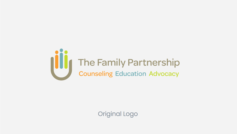
The Family Partnership supports families and individuals in overcoming barriers related to deep poverty and trauma. I led the logo refresh, transitioning to a single color and removing the tagline to improve brand recall. The new primary orange reflects the organization’s core values—inviting, warm, and inclusive—while conveying urgency and action. The softened logomark reinforces a tone of openness and humanity, reflecting the healthy, vibrant, and diverse community the organization strives to build.
MY ROLE
Creative Director
Branding & Identity Design
Skills employed
Logo & Identity Design Creative Direction
Brand Guidelines
Brand refresh
Led the logo refresh process by transitioning to a single color and removing the tagline, the logo encourages better brand recall. The new primary brand orange encapsulates the organization at its core – inviting, warm, inclusive, friendly and supportive, yet it instills a sense of urgency and a need for action. It represents the healthy community it strives to build: vibrant, forward, bold, positive, diverse and strong. The softened logomark sets the tone for open conversations led by humanity.
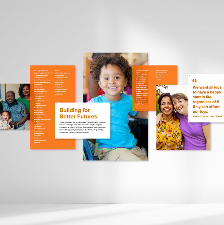
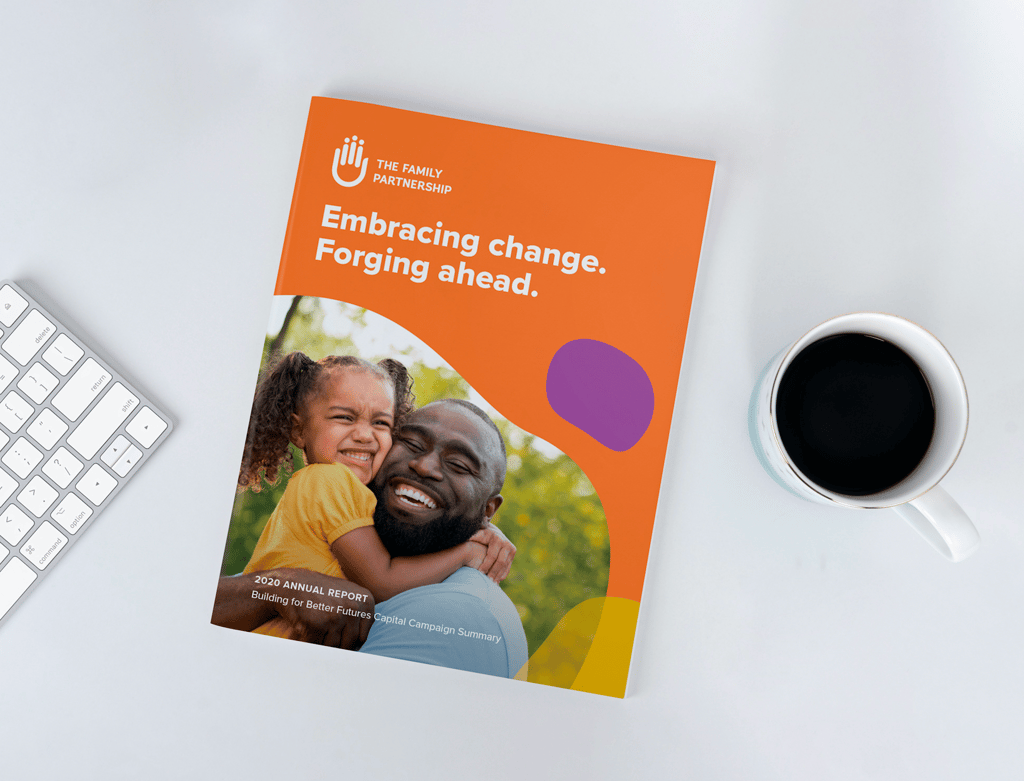
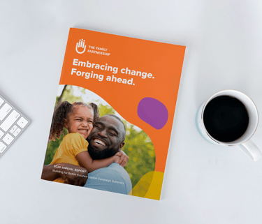
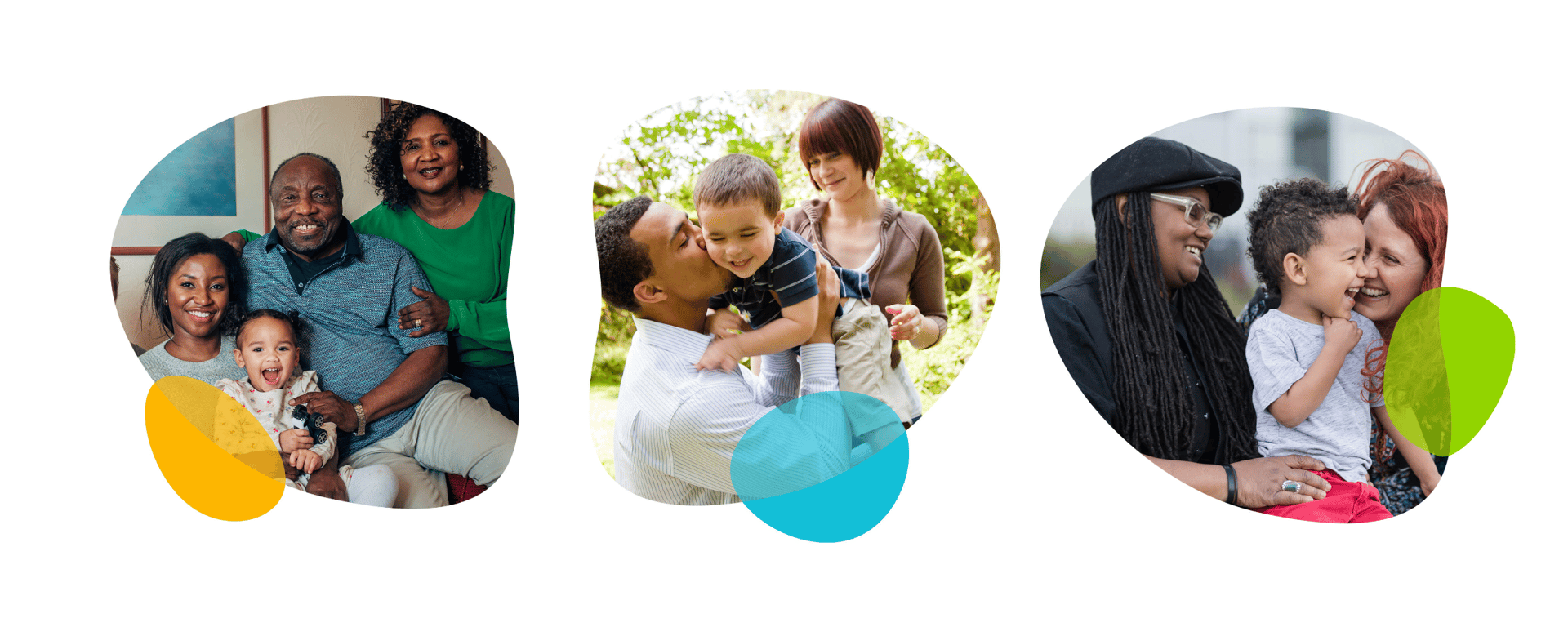
Provided creative direction for the development of additional materials, such as swag, digital and print collateral, custom iconography and patterns, interior and exterior signage, and a curated library of photos. All of the brand parameters were outlined in a fully designed usage guide to be referenced for all future brand applications.
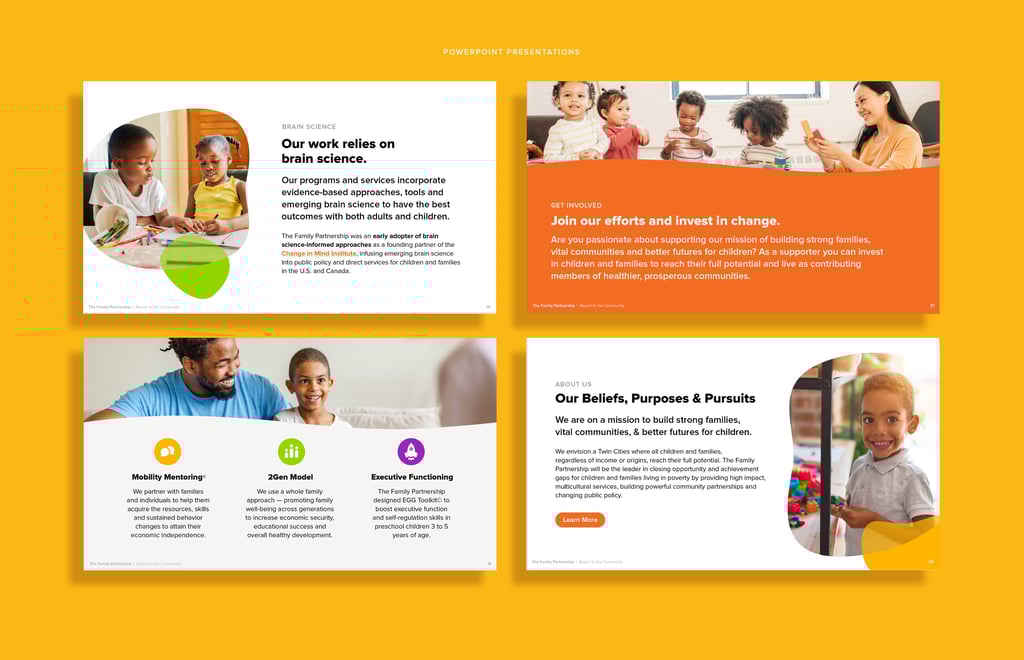
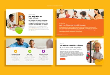


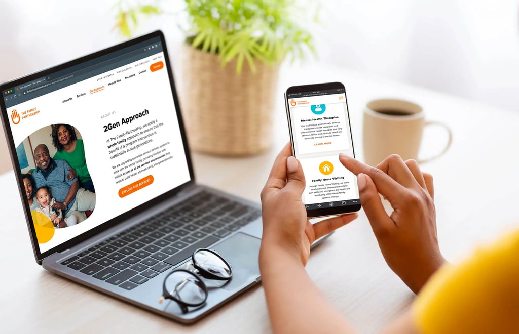
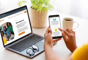
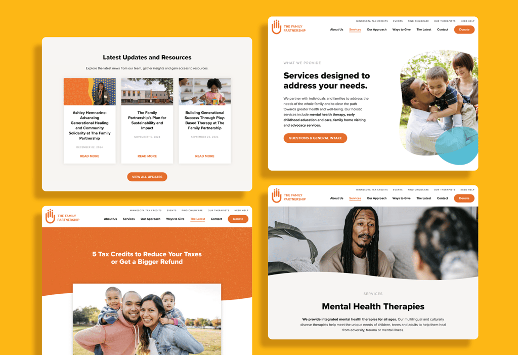
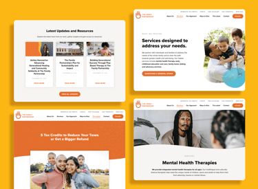
Website design
Our team interviewed all program leads to best understand how the website could support both staff and the families they serve. After auditing the existing content, I worked closely with the organization’s copywriter to ensure everything was accessible and web-friendly. I then designed a site that is easy to navigate, brings the brand to life, and centers the mission and humanity behind The Family Partnership’s work.


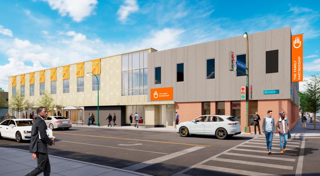
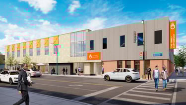
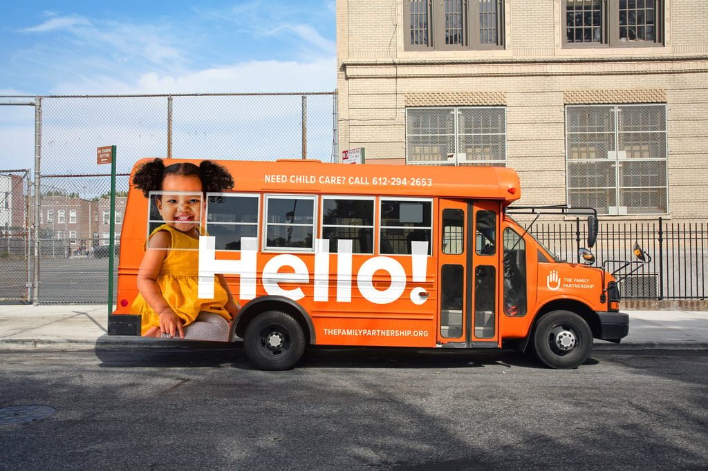
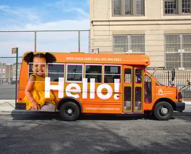
Experiential & Wayfinding
Our team’s comprehensive approach shaped the building experience from signage to murals, spanning wayfinding, wall graphics, and display installations in materials including vinyl, backlit signage, painted concrete, plexiglass, and metal. We collaborated closely with the architect, signage vendor, and city officials to ensure code compliance, while guiding all decisions to align seamlessly with the new brand identity. Because the building opened alongside the rebrand, our input was critical in making sure every element reflected the organization’s visual and experiential vision.